2013-02-25 / OTI
In Part 1, we came up with a list of security features Commotion lacked. We took this list of unimplemented security features and used OSHA's hazard communication guide to clarify our language[9]:
- Instructions are more likely to be followed if consequences are described.
- Sentences that include a long string of effects or other items can be made clearer by putting them into list.
- Keep sentences short and direct. Use no more than two subordinate clauses. Use the active voice as much as possible. Use short words of one or two syllables as much as possible. Choose commonly used, familiar words, but avoid colloquialisms and slang.
- Use only common abbreviations and acronyms, and then give their definition as soon after their first use as possible. Occasionally, however, an abbreviation or acronym may be so familiar to intended audiences that it may be used without a definition. In fact, some may be more familiar than the full name (e.g., OSHA, EPA, SARA, F, C, TLV, and TWA)
Our first change was to move the negative “does not” that is stated in the header into each statement. This ensures that each statement can be read out of context of the whole with full meaning intact and gave us greater freedom in our wording on each line. We then switched the focus from attacks that Commotion does not protect against to consequences that come from lack of feature sets. For example, we removed "malware" in favor of highlighting the result of data and identity insecurity. We then went through each statement to remove jargon/acronyms and make the language more active.
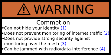
 **WARNING! **Commotion:
- Cannot hide your identity
- Does not prevent monitoring of internet traffic
- Does not provide strong security against monitoring over the mesh
- Can be jammed with radio/data-interference
In accordance to ANZI "Product Safety Signs and Labels" [10], the term "warning indicates a potentially hazardous situation which, if not avoided, could result in death or serious injury." We felt that this was appropriate for the current non-secure release of Commotion. The next highest level, "danger" is "to be limited to the most extreme situations." We will reserve this warning for our future release of a "secure" Commotion distribution to emphasize the ways in which it does not provide full security. We hope this escalation will signal to users of Commotion for secure communication that they put themselves in danger by assuming security where it does not exist. In the future, as we have translation done on our documentation, we will also work with translators to ensure that region-specific translations are not direct translations, but instead clearly convey the warnings to the users in the most understandable way. With our language solidified, we started on our second question: How do we ensure the "ability of the individual reading [the warning] to understand the information sufficiently to take the desired action"[1] for their specific situation? The first thing that we did was look for existing literature on warning labels in software, which was sorely lacking. So, we turned to warning labels on tobacco, drugs, and dangerous machinery. "A review of the science base to support the development of health warnings for tobacco packages" is an interesting read for its own merit, and was a great resource in helping us ensure that the warning was in the best possible site placement to reach our users.
- ...shoppers typically start at the dominant visual element (often the brand name), and are then drawn to the next strongest element (usually the next most dominant visual element).
- A related and important point is that viewing patterns are driven by packaging layout rather than a function of “what people want to look at” or what they think is important. In other words, the fact that a message is frequently missed or overlooked does not mean that shoppers think it is unimportant. It simply means that the message was not adequately highlighted on the package...
- In the few seconds that shoppers typically spend looking at a package, they can actively consider only three or four primary design elements... Research repeatedly found that adding extra messages does not usually increase packaging viewing time, but instead results in more elements fighting for attention in a ‘zero-sum’ game. Package viewing patterns suggest that the “less is more” axiom is nearly always true...
- Package viewing patterns are largely consistent across cultures and product categories because they are driven mainly by human physiology rather than by cultural patterns of preferences.
- Is it important for a packaging design to establish a dominant viewing flow that leads consumers from their “start point” to the other critical packaging elements... What doesn’t work well is a balanced lay out in which the main visual starts consumers in the middle and the other design elements surrounding it are all secondary. The ineffective balanced layout forces consumers to ‘randomly’ choose among directions, and this often causes them to miss important / key elements of the labeling.
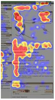
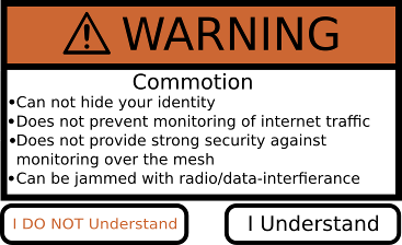
 Our warning needs to be the main visual element on the page and highlighted above everything else on the screen. Pages that display the warning must have minimal eye-catching elements to ensure that the user is not distracted from the warning. Eye tracking research [8] shows that "users start by reading across the top line and then look down the page a little and read across again and then continue down the left side."[8] Based upon this we decided to place our warning as the topmost content item on the page. This would be the first and most bold item that varies from the generic website themeing. Beyond this placement, we also decided to add a secondary javascript element of this warning when a user loads the downloads page. We added this extra layer on the downloads page because it is the portal for aquireing the software. We felt an additional layer of warning was warranted. This requires the user to click a button stating that "I Understand" to highlight the importance of the warning. We also provided a second button "I DON'T Understand" which sends the user to a more in-depth explanation of the current "in-security" of the current releases.
The commotion site has a vibrant design. It has pastel tones and "speech bubble" section dividers. We assume that a user will quickly start to ignore site content that is themed similarly as navigational content. A warning label must stand out from all common site elements in order to ensure that a user sees it as important content. When we looked at research on font use in warnings we found we had used the most effective warning fonts as our generic site fonts. The Commotion site uses AsapRegular, Ariel, or sans-serif depending upon the availability in a users browser. We were left with size and color to visually differentiate our image. We chose a warning header size that was 1.5 larger than our largest header fonts and using all Caps. Lastly we decided that none of the text on the warning could be text converted to an image format. It is important for translation and text-based browsing that this information is available as html & text.
While the warning must stand out from the site,we came across a warning that it must not look like advertising as "Users seldom look at banner ads or anything that remotely looks like an advertisement."[8] In order to accomplish this we decided to use a traditional warning color scheme. This was a simple process, as there are common color combinations to go with different warning levels. "Use a red background with white lettering for danger, orange background with black lettering for warning, and yellow background with black lettering for caution to indicate decreasing levels of hazard."[11] This left us with a orange background. The debate over what icon to use for our warning was quickly extinguished by a study cited in the OSHA's hazard communication guide which stated that "The presence of the signal icon had no significant effect on hazard perception." We decided that adding content that did not effect hazard perception, and had the possibility of distracting a user from the important aspects of the message was not worth the possible risk.
 Now that we have a warning that will clearly convey the required information, we need to ensure that a user take the desired action. The desired action is for users to NOT use Commotion for communication requiring security unless they are layering other secure communication tools on top or along-side it. We hope to ensure this with the “I Don't Understand” document. By placing links next to each warning bullet point to projects that address the security needs that Commotion we hope to lower the “cost of compliance”[12] to a level where the user does not “give up” and will either pair these technologies with Commotion, if there needs require mesh support, or use a security tool that is appropriate for their needs.
 The final Commotion warning can be seen on our downloads page. This process was an enlightening one. The most important lesson we learned was that a truly good warning is a clear and simple one. Warning labels have been internationally standardized. Our warning would not seem out of place on the side of dangerous machinery in any country. By following standards developed over years of research we can best ensure that our users take the warning with the gravity that it deserves. Creating tools for privacy comes with a deep responsibility to ones users. In an age where already spun news stories can be chopped into misleading 140 character tweets, and when these ideas make there way in to overheard conversations at parties and conferences, the responsibility falls on us to ensure that the public face that we do control is clear about the perils of our technology. A warning is merely one of the steps that we must take to educate our users.
- Refrences
- https://www.osha.gov/dsg/hazcom/hc2inf2.html#3.2.1
- http://www.diriwa.org/
- https://www.torproject.org/
- http://killerapps.foreignpolicy.com/posts/2012/11/05/internet_in_a_suitcase_ready_for_field_testing
- https://www.nytimes.com/2011/06/12/world/12internet.html?pagewanted=all&_r=1&
- http://www.wired.com/threatlevel/2011/12/internet-suitcase-dc/all/
- https://commotionwireless.net/
- http://www.usability.gov/articles/newsletter/pubs/032010news.html
- https://www.osha.gov/dsg/hazcom/hc2inf2.html#3.3.2
- https://www.osha.gov/dsg/hazcom/hc2inf2.html#3.1.8.1
- http://www.ismp.org/newsletters/acutecare/articles/20060824.asp
- https://www.osha.gov/dsg/hazcom/hc2inf2.html#3.1.6.8